
PROJEX PRIVATE LABEL REDESIGN
CHALLENGE: Refresh an International Private Label to a “tougher” look and feel and adapt standards for use in the Domestic marketplace.
SOLUTION/CONTRIBUTION: Designed logo and co-designed look and feel of packaging. Bulked-up logo using heavier and angled font in a riveted plaque-like shape. Highlighted "Pro" using color to allude to a higher-grade product. Kept the original blue and gold color scheme but simplified packaging by removing pattern. Added gradient for depth, introduced hero product photography, and replaced font with a cleaner style. Developed color bar to differentiate items within the same category.
ADDITIONAL CREDIT: Ted Mielas (Co-designer), Aldo Peralto and Al Krasauskas (Production)

PROJEX //// LOGO PACKAGING BEFORE + AFTER
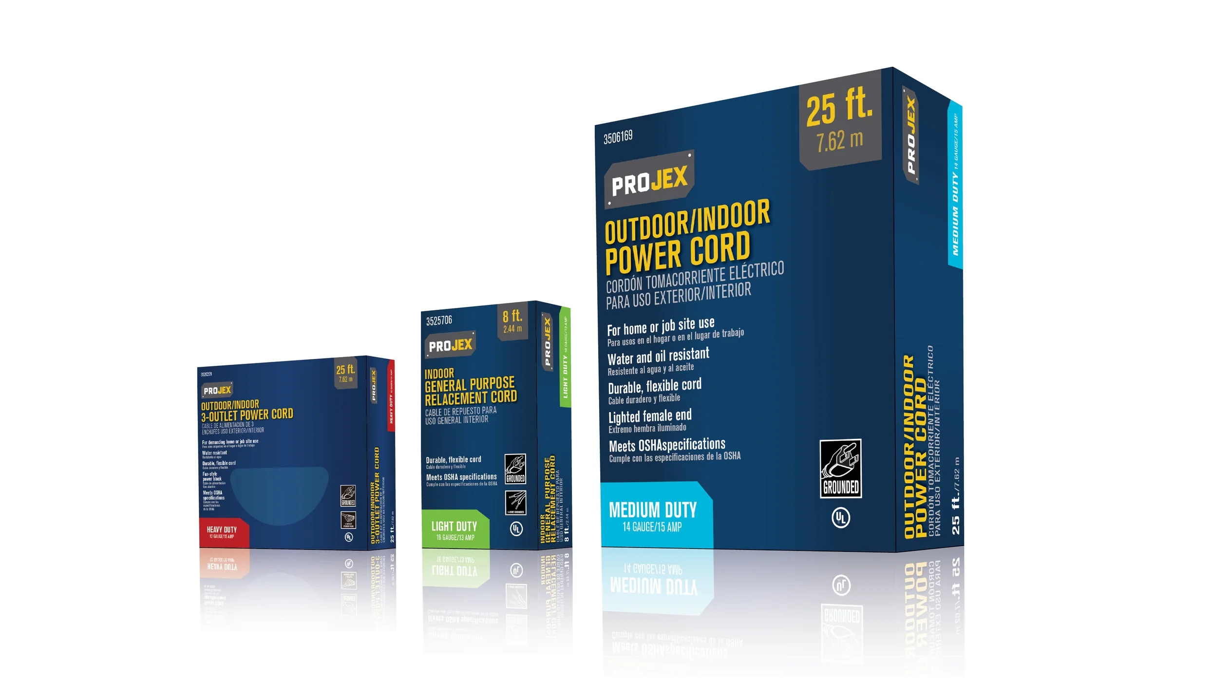
PROJEX //// PACKAGING WITH COLOR BAR

PROJEX //// PACKAGING BEFORE + AFTER